Simple Or Daring: What’s The Best Approach For Web Design In 2021?
When you put in the time and effort to create a modern website, you don’t want mediocrity. If you were willing to settle for that, you’d find the simplest website builder around, grab the default template, and call the job done. And hitting the heights of online performance demands a top-notch build that can rival the biggest websites in the world. It’s a tough task at the best of times, but it’s particularly brutal when you have limited resources.

You don’t have the luxury of humming and hawing over the design approach you run with, or commissioning several websites so you can pick out the best and discard the losers. You need to commit to a design aesthetic and stick with it until you have a workable result. But what aesthetic is the right choice? And what if you get things wrong?
There are two big schools of thought that often come into conflict with web development and design. There’s the school that favours simplicity, of course, and it gets a lot of positive press along with support from huge brands like Google and Apple. Think about the minimalism of the influential Google-developed Material Design stylistic language. And then there’s the school that favours boldness and difference, contending that it’s worth it to sacrifice simplicity if you really make an impact.
Should you keep things simple? Or should you be daring? That’s the issue we’re going to consider in this post as we attempt to determine the best approach for web design in 2021.
The no-frills route is great for targeted action-centric sites
What I’m calling the no-frills route is functional minimalism: you don’t need every element to be as small and unobtrusive as possible, but you do need to ensure that everything present serves a purpose. If there’s an image somewhere for no particular reason, you must remove it. Now, this isn’t the right path for every site, but it’s perfect for a site that serves a niche purpose and is built entirely around taking action (instead of getting people to pore through resources).

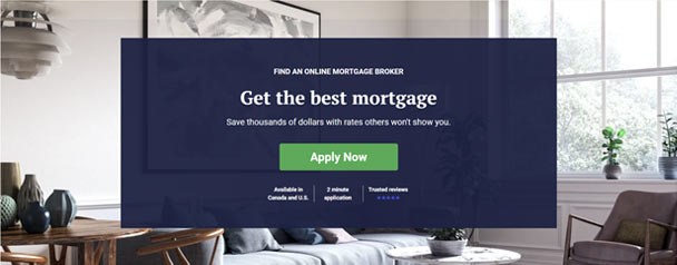
Pulling from the exotic array of sites from my browser history, Breezeful is an example (see above) that concentrates on its core purpose. The core action is finding a mortgage broker, and everything is built around that: bold unmissable CTAs, SEO-tweaked copy to hit all the keywords, relevant internal links, and… Well, nothing much. If you’re looking for entertainment, why are you visiting a brokerage service?
A shocking design choice can prove truly captivating
Being memorable is obviously a big deal. There are different ways of being memorable, of course, and one option is to provide an exceptional service. If you can do that, you can just about get away with a weak website. But it’s extremely hard to be that impressive through your fundamental value proposition. And even if you can manage it, why wouldn’t you take an opportunity to grab some attention through your website? Just one bold design choice can get people talking and build up some buzz for your brand.
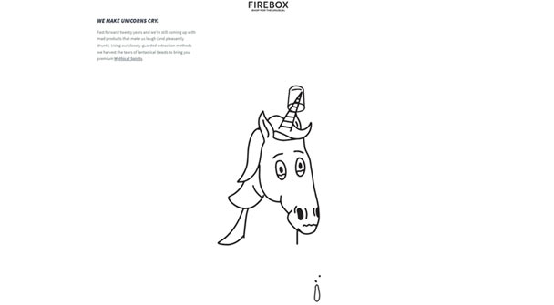
My go-to example for this (also from my thrilling history) is the About Us page at Firebox. The typical About Us formula is simple: here’s what we do, here’s why we do it, and here’s what we hope to achieve. If you’re lucky, you might get some team photos or a motivational slogan. But that isn’t what you get from Firebox. Instead, you get a ludicrously long page with thin but punchy content that gets you hooked and keeps you there.

Subtle animated elements feature as you scroll down, making the absolute most of the available text and images. You wouldn’t expect it, so it really piques your interest. The page must have taken a lot of work to create (though not that much, which is something we’ll address later), and I think it’s absolutely worth it.
It’s easier in various ways to opt for simplicity
You should start as you mean to go on, and practicality is certainly a core concern here. You may want to make the best site you can make, but your hands are tied by how much time and money you can spend on it — and since there’s no such thing as a perfect site, you have to draw a line somewhere. With this in mind, it’s impossible to ignore that it’s generally easier to opt for design simplicity and keep it going for future updates.
There’s a wrinkle here, though. In truth, while moderate simplicity (the no-frills approach we looked at earlier) is easy, optimal simplicity that really embraces the minimalist aesthetic can be as hard to achieve as something bombastic (if not harder).
Copywriters know this all too well. It’s so much harder to describe something well in twenty words than it is to manage it in two hundred words, and the hardest-hitting copy is usually the most succinct. This leads us neatly into our inescapable conclusion, so let’s wrap things up.
Despite the framing, there’s no mutual exclusion here
Yes, you read that correctly. The titular question doesn’t really need to be answered, because it’s perfectly possible for web design to be simple and daring. That Firebox page doesn’t do anything overwhelmingly complicated from a design standpoint, but it stands out because the text is well-written and the structure is quirky.
So when you’re designing your website, you should first focus on functional minimalism by covering everything that’s necessary — and when you’re done, you should think about what tweaks you can make to set your site apart from the competition. If you get the balance right, you should come away with a speedy and well-framed store that has at least one thing that the average visitor will remember. That’s a recipe for success.
