‘next’ – Online Shopping Should be Convenient; So Why isn’t it?
There are many different reasons that drive us as consumers to shop online but I will always argue that the main reason we do is because it is ‘convenient.’ We like the comfort of sitting with our tablets or laptops in the comfort of our own homes, or even being in a rush on our way home from work and still having time to shop from our mobiles on the move but, as a consumer, it can be very frustrating when the website we are attempting to shop from has forgotten about ‘convenience.’
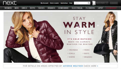
With so many different online trends flooding the market it is very easy to forget (especially in the world of fashion) about the functionality of your website, even as a leading brand in the market. In today’s blog I will be evaluating the globally recognised, UK brand ‘next’ and the importance of clean website navigation.
Firstly, before I continue this post let me just say now that I am actually a loyal customer of ‘next.’ I love the brand especially for my younger brother and sister’s and for homeware but I have to admit, I pay for the directory because over the years I have always found myself frustrated with their website. I want what I want and I want it now! (If only it was always that simple).
My Online Shopping Experience on 'next'
Okay, I am looking to buy some trousers for my 11 year old brother so the first thing I do is click on the ‘BOYS’ navigation bar. Obvious right? I then click on ‘Older Boys 3-16 years’ to ensure I only view products in a category suitable for my brother’s age.
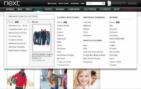
At this point I would expect to be able to narrow my search further by product, age and preferably colour (possibly also by price) but these are the main factors that will make my shopping experience so much easier. Instead, I am presented with ranges, like in the directory. Now this is great for visualisation and for giving styling tips or suggesting new products to consumers as lifestyle images are always inspirational when shopping but, it doesn’t really help me find what I am looking for quickly.
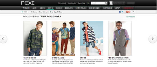
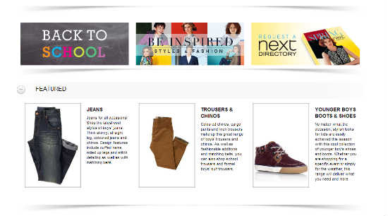
Now as you can see in this third image, I am provided with the option to also just search by jeans or trousers but this is featured below the fold and away from my visibility, so at first I didn’t even notice these options were there.
I first clicked on ‘Chino Classic’ as I thought this could help me find what I’m looking for; some new stylish trousers for my 11 year old brother. The first problem I encounter is that I am once presented with a directory image as opposed to individual product images. This page also doesn’t seem to present me with any further navigation options.
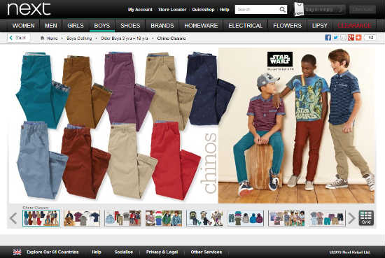
To add to my frustration, as I scroll through it seems I am indeed viewing an entire range of ensembles with Chino’s and Trousers as opposed to just Chino’s; again there is no navigation on these pages to help me avoid unnecessarily looking at t-shirts and jumpers.
At this point, to be honest I’d have just switched off because it is taking me too long to learn how to use the website let alone find what I actually want. However…In the name of research…I continue…
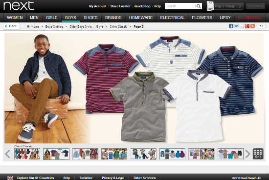
I think that there must of course be a way to search by age because I really don’t want to trawl through every single pair of trousers to only then find the product is out of stock in the size I require. So I change tactics.
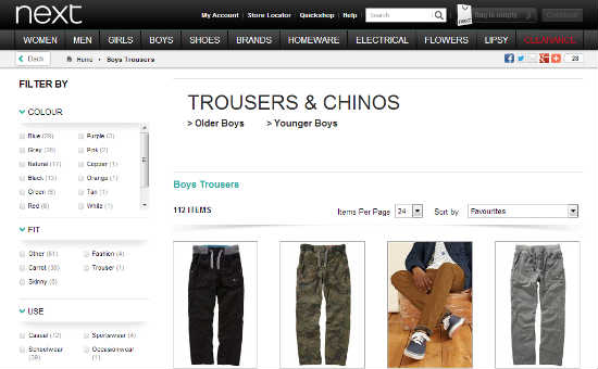
I go back to where I originally started my search at the top navigation, again clicking on ‘BOYS’ and see that I can search by the right hand navigation of this dropdown menu. I click on ‘Trousers & Chinos’ hoping to find further navigation.
OH WOW! Yes very excited to see to the left of my screen a ‘FILTER BY’ navigation. This is brilliant, I can search by colour, fit (style), use (very important when it comes to scruffy boys), design, additional features, fit and brand and, and, AND…? Nooooooo! Why can I still not search by age?
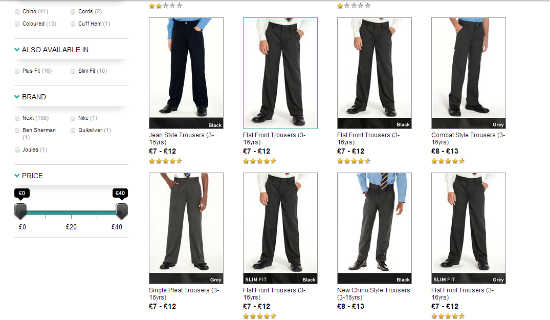
As an e-commerce retailer you might think that this doesn’t matter too much if you keep well stocked but, as busy periods such as Christmas or for a retailer that is famously known for their sales it is really significant to allow people to search and filter through your products as quickly as possible.
In a shop it is different; you can get away with grouping ages because you have less floor space to work with than online and on the rail, everything is arranged in age order. The difference being that in a store, your consumer can pretty much see everything you have to offer at a glance straight away. They will eye a product, run to the rail, quickly find the correctly labelled hanger and make a purchase or move on in a matter of minutes, maybe even seconds depending on how big your shop is.
On a website, shoppers get bored trawling through the hundreds of products you have to offer because they feel they don’t have the time to browse (and they probably don’t). Shopping online should be quick and easy. A customer is more likely to be more engaged with your site and stay on it long enough to make a purchase if they can find what they are looking for. Remember, this should be the more convenient method of shopping because of the science behind it.
I'm Sorry; I've Moved on - It's Not Me it's You!
At Christmas, I moved onto highstreet competitor ‘River Island’ because on there I can search by product straight away followed most importantly by age, then colour and price; it made my shopping experience so much quicker and enjoyable even though they have smaller collections than ‘next’ so have less reason to offer more search methods.
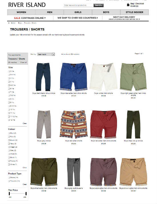
In fashion, it is so easy to forget about the functionality of your website being a priority. Images are great and for any e-commerce site incredibly important, but most importantly you want your customer to find what they want as quickly as possible and buy as opposed to abandoning your website.
For this reason, people’s shopping and browsing habits offline really do need to be mirrored and catered to online, for all different audiences to meet their demands. Your navigation should provide quick search solutions for your audience of shoppers that already know what they want (especially for return customers) as well as catering to visitors that are just window shopping (yes people still do this online, especially when waiting for pay day). Test your website and see how quickly you can find what you are looking for because it’s no good if your website frustrates those who should know it best, let alone your customers.
Just because you are a retailer doesn’t mean you are no longer a customer! Think about how you search online and then reflect this in your site’s navigation.
Follow me to learn more about how to increase your e-commerce revenue and ROI (return on investment).

