NET-A-PORTER: Seamless eCommerce User Experience
This is the second section of a three part investigation into multi-million dollar company NET-A-PORTER’s online (and offline) success. In this post, I am looking at what makes their fashion eCommerce site so successful, and what you and your business can learn from it.
Missed the first part? Catch up here: NET-A-PORTER: Seamless Integrated Marketing Across Multi-Channel Platforms
The Homepage
Primarily as the first page users land on, it is representative of the brand and its ethos in an on-trend homage to luxury designer fashion portrayed through the elegant glossy images. At my time of visiting there was a clear call to action for the sale (which made me have another look even though I had crippled my bank balance already).

At the bottom of the page you are told how many shoppers are online (what an incentive to get buying quick!). While the Live Feed of what people have recently brought shows a constantly changing selection of products, which is great for showing off your stock. As well as providing elements of social proof this feature offers an insight into what people are buying, and how quickly items are going, which is very important within a trends-based industry such as fashion.
While there is no static copy on the homepage (which we would absolutely not recommend as best practice for eCommerce SEO) they do feature snippets from the magazine (yes there is also a magazine) which you can buy (yes, of course from the website, or in an app!) if you fancied a read. This brand understands that they are catering to an audience who know exactly what they want (which is luxury, designer clothes, and lots of them) and so they offer the chance to buy them straight away, while teasing them with what others are buying, or showing them where they can go to browse the editorial content.
Your homepage should do exactly this; show users what you are about straight away while highlighting what else they can look at, then take them there.
Products

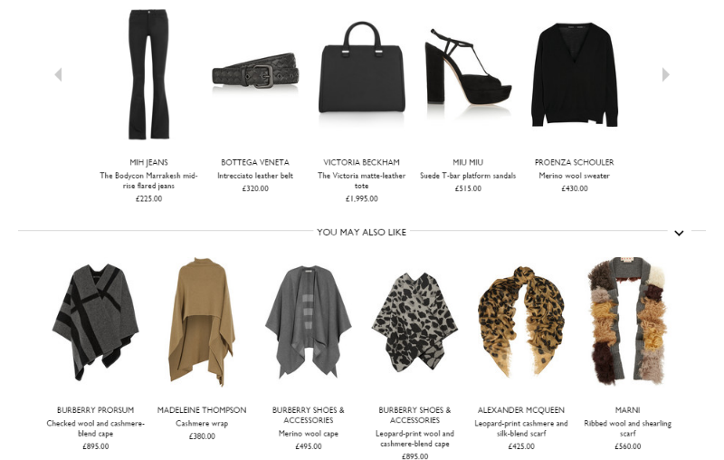
A really good time to encourage customers to buy more from you is when you know you have their attention (i.e. when they’re on a product page, or when they have added something to their wish list or basket). If you can see they already have an intent to buy, it is easier to tempt them with more things to buy! NET-A-PORTER do this brilliantly by not only showing users ‘How To Wear It’ with other items that compliment the product they’re interested in, but showing similar ones they may like too.
As I mentioned in Part 1, having a size guide on every product page is a very good idea: the more sizing information you can give a user, the more likely they will be to buy a product from your site because they will be confident that it will fit.
Wish List

If you want to guarantee that your customers will come back again and again, allow them to create a Wish List. Although this is becoming a common feature among many eCommerce sites, it is not valued enough. By offering the chance to create a Wish List, yes you give users the chance to leave your site without making a purchase, but you also make it convenient for them to come back to a list of items they love (once they have been paid / talked themselves into it / regretted not doing so), thus making them more likely to buy in the long-term.
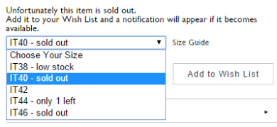
NET-A-PORTER have also utilised the Wish List to tell users when products they are interested in are back in stock. This means that they will not need to keep checking when they can buy this item, making it even easier for the user to purchase.
Delivery & Returns
If you are selling a product online you will have to get this product from your warehouse/stock room to the customer. This is not something that the high street has to deal with because the clothes are paid for and picked up there and then. For the most part, this is an understandable cost and waiting period for those that shop online. However, by making this inexpensive and convenient you will please your customers, making them more likely to come back and buy from you. NET-A-PORTER showed that they fully understand that their customers may not want to wait and became the first clothing retailers to offer same-day delivery in London and New York. This level of innovation and convenience is partly to do with why NET-A-PORTER is so successful, but also their clear understanding of the wants and needs of their audience and ability to cater accordingly. (Plus, with a single item costing up to £10,000, you can afford to get it there quickly).
In the same vain, because the customer cannot try the clothes on before purchasing as they would in-store, it is more likely that they will have to return the item (see above for size guide tip). By having fuss-free returns you are simply saying to your customer, “don’t worry if it doesn’t fit, try it anyway!”. This is important because a customer is more likely to drop out of the conversion path at this final stage due to any niggling doubts, then to return an item later on. It is, therefore, an integral part of your eCommerce service that you offer an easy returns option, or users will be put off shopping online and prefer to go into a (what could end up being competitor's) store.
Previous: NET-A-PORTER: Seamless Integrated Marketing Across Multi-Channel Platforms
Next: NET-A-PORTER: Seamless Social Media Success
Follow my contributions to the blog to find out more about digital marketing, or sign up to the ThoughtShift Guest List, our monthly email, to keep up-to-date on all our blogposts, guides and events.
